HUBILO DESIGN SYSTEMS
Building a Multi-brand design system from the ground up to connect global teams on a common design language foundation within the Hubilo brand portfolio.

Role & Responsibility
Lead UX/UI Designer
Conducted user research & competitor analysis
Defined user flows & wireframes
High-fidelity prototyping
Collaborated with developers during implementation

Problems
Through the past functional years, Hubilo identified an absence of a Design system with a proper understanding of design principles. A lack of uniformity in the components, theming, consistencies, and conflicting color logic was observed and thus a need to incorporate the same was recognized
Solution
Built on strong foundations, guided by clear principles, and aligned with modern design trends ensuring consistency, inclusivity, and future readiness across all products.
WHAT IT
SHOULD
BE
Scalable
A scalable design system allows the organization to adapt to changes in the design landscape and accommodate future growth. This means that the design system should be flexible and able to adapt to new technologies and user needs over time.
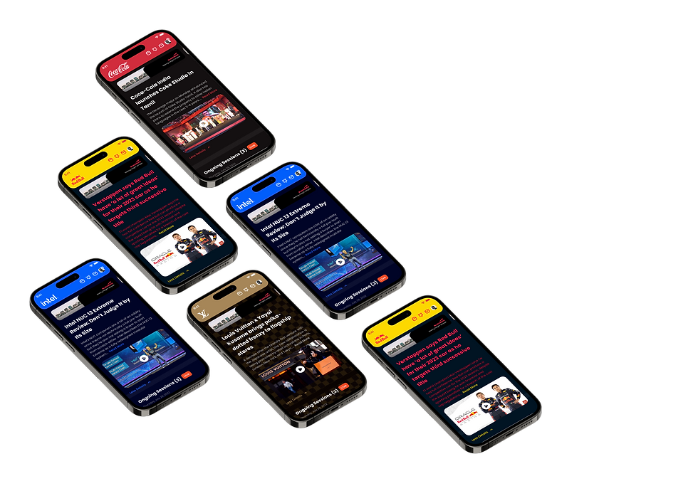
Customizable
All the services (platforms) that are provided to the users/ clients should be customizable as per their brand language i.e the color language, displays etc. and thus keeping the same as a prerequisite while designing the components of the Design System
.png)
Accessible
Adherence to WCAG (Web Content Accessibility Guidelines) standards helps to make the designs accessible to a wider range of users, including those with disabilities. This is important for creating inclusive designs and improving the user experience for all.
AND FINALLY, LET’S SEE THE DESIGN COME TO LIFE
Atoms
While abiding by the structure of Atomic Design, a full-proof library of all the elements that might be required within the Design System were created.


.png)
.png)
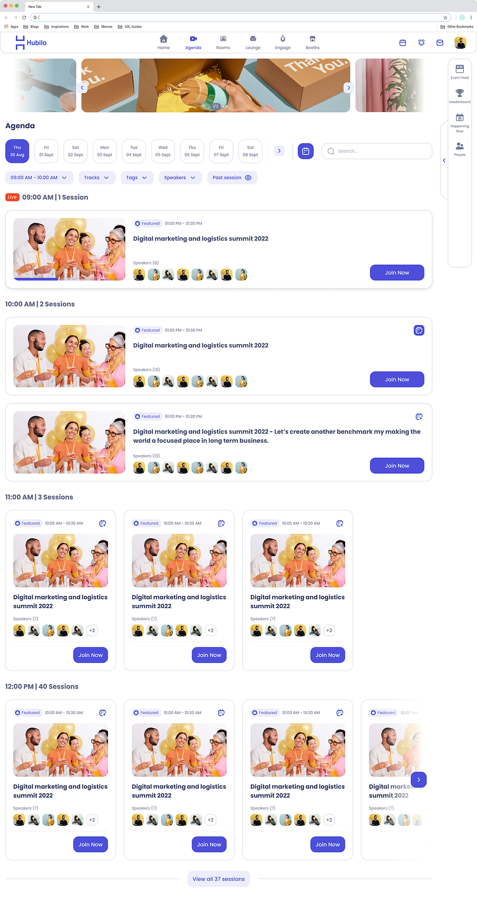
Patterns
The patterns are comprised of screens made up of reusable components that are a part of the initially designed atoms/ elements.
This part of the process was mainly focused on the implementation of elements designed, within the Web//Mobile Screens


Impact
+70% Consistency — Unified components ensure cohesive experiences.
50% Faster Handoff — Tokenized colors & variants speed up delivery.
100% Accessible — WCAG AA/AAA compliant for all users.
Scalable & Customizable — Easy multi-brand color adaptation.
Higher Efficiency — Designers focus on experience, not rebuilds.

THANK YOU FOR COMING ALONG ON THIS JOURNEY.